
I make Titanium Museum’S campaigns ODD AND OBTUSE. DELIBERATELY unexpected AND slightly otherworldly. ‘PUZZLING’ both LITERALLY AND PRACTICALLY. it is my reaction - A FORM OF PETTY REBELLIOn - TO THE rather trite themes PERSISTING IN fashion and eyewear campaigns: VARIATIONS OF A MODEL IN A LIFESTYLE SITUATION. WHETHER IT BE A BLONDE WOMAN BY A POOL OR IN A LEATHER HARNESS. i juST could nOT CREATE THE SAME PHOTO STORY that has BEEN EXHAUSTIVELY RETOLD FOR THE LAST 50 YEARS.
the modern CAMPAIGN should ACTIVELY CONFUSE YOU. RATHER than tell you a story, it should REINFORCE YOUR WILLINGNESS TO find and LIVE the story FOR YOURSELF.
THIS IS tITANIUM mUSEUM’S FIRST major “CAMPAIGN” - LAUNCHED now THE COMPANY HAS BEEN ACTIVE FOR almost 3 YEARS With SCANT VISUAL MEDIA released BEYOND PRODUCT IMAGES. THIS CAMPAIGN COVERS OUR FIRST 3 COLLECTIONS (‘ACCESSIONS’) OF EYEWEAR (‘ARTIFACTS AND SPECIMENS’). tHE IMAGES ARE designed to quickly repel or attract- A FORM OF BINARY FILTER MECHANISM: For those attracted, I want them to look deeper into TM’S world. FOR THOSE WHO DON’T GET IT, I AM NOT TRYING TO WIN THEM OVER. THIS IS HOW MY EYEWEAR designs AFFECT PEOPLE: POLARISING THOSE WHO HATE IT FROM THOSE WHO LIKE IT. IT’S DELIBERATE, BECAUSE I BELIEVE IF NO ONE REALLY HATES SOMETHING THEN NO ONE WILL REALLY LOVE IT EITHER ☯.
A ‘lived story’ is hidden in the campsign: SUPERFICAILLY the images initially IMPRESSION game engine CGI/AI generated characters. but delve into closer inspection, NOTICE clues, hidden QR’s, codes, emails, printed matter… Select types of curious people - superfans - have begun to find the crumbs on this trail. they dig, they act, and discover physical ‘Easter eggs’ - FORMS OF gifts - I have hidden in real world locations. THIS ADDS profound value to the excersize: Finding treasure via a map quest will always be more exciting than the same treasure handed to you.
The campaign makes no explicit mention of any of this. THE VARIOUS CLUES ARE DISGUISED TOO, BECAUSE THE MORE COMPLEX THE breadcrumb trail, RESULTS IN THE EARNING of a particULAR hidden Easter egg is more rewarding. you COULD be the very first AND only person to reach THAT PRIZE? POSSIBLY THE ONLY PERSON WHO TRULY experienceD A LITLE ADVENTURE the brand carefully designed. ITS MORE MEANINGFUL AND REWARDING TO ME TO ENGAGE THIS WAY. and if The CURIOUS PROTAGONIST talkS about it, that TALK IS MORE POWERFUL TO IT’S LISTENERS THAN ANY DOUBLE PAGE ADVERTISING SPREAD.
I am CREATING material goods whilst being aware experiences are MORE RELEVANT AND DESIRABLE IN OUR LIVES. this campaign addresses that in a deliberately oblique way, ADding more DEPTH TO THE EXPERIENCE.
THE MECHANISM EXPLAINED WITH AS FEW SPOILERS AS POSSIBLE:
HOW THIS CAMPAIGN WORKS in practice: Imagine an object hidden in an airport locker, or another public hidden location. There is no announcement, no direct instruction. The only way to reach it is by following a chain of clues embedded across ALL OF what we make: campaign images, hidden QR codes, fragments in emails, readme files, small details that most people will ignore.
If you look properly - not casually, but properly - you can find yourself being led, in a very indirect and roundabout way, to that exact location.
The point of running a campaign this way is NOT FOR scale oF exposure. The point is that a small number of people choose to engage deeply enough to find it..
THE MECHANISM filters for curiosity in the same way certain institutions and agencies once embedded real-world clues in public spaceS [ref. here] - not to advertise, but to identify the people willing to pay attention. This is the same idea applied to a brand: an immersive system, a unique vibe, available to anyone, but only activated by those who actually look.
TECHNICAL NOte on how the avatars were created:
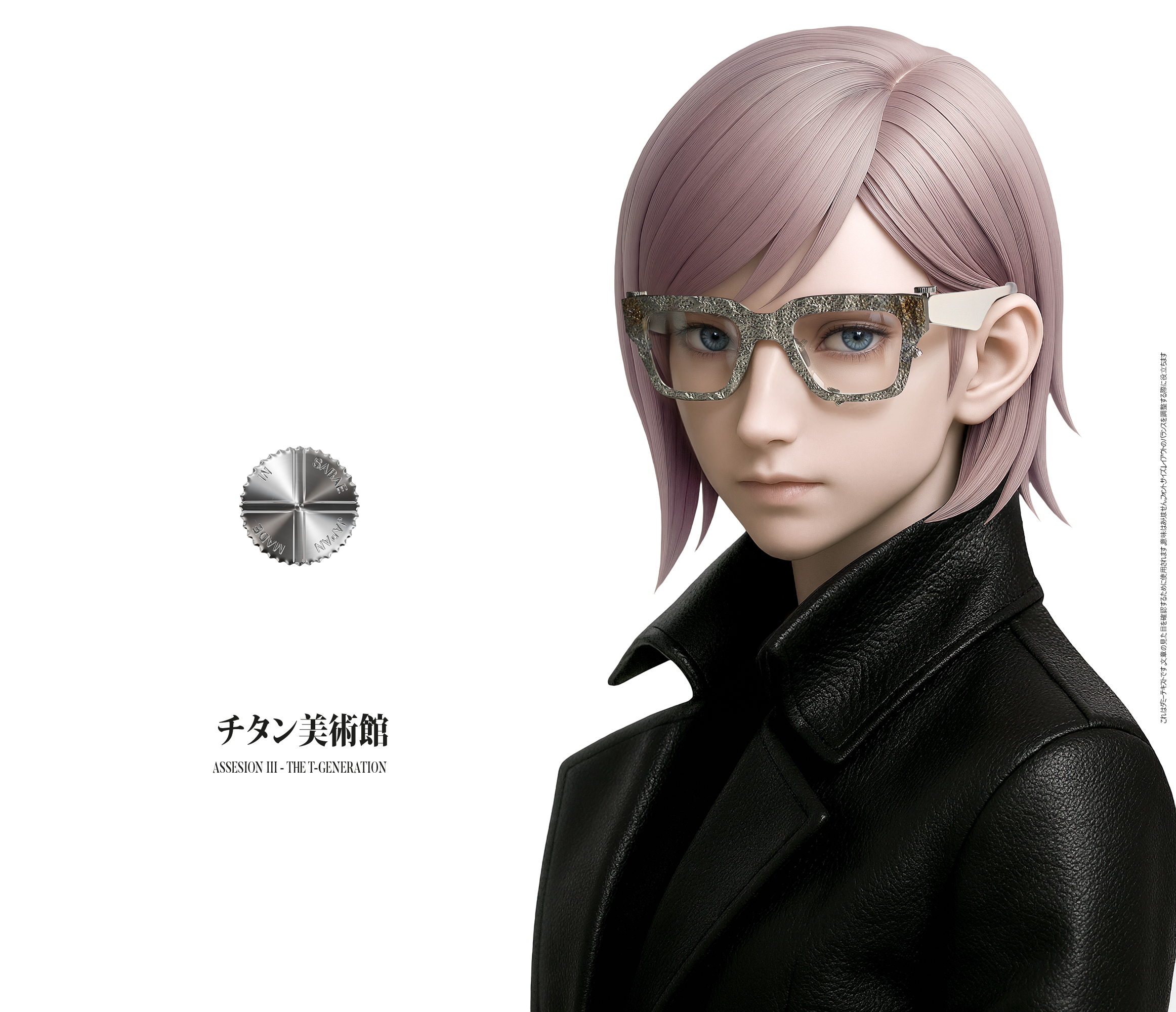
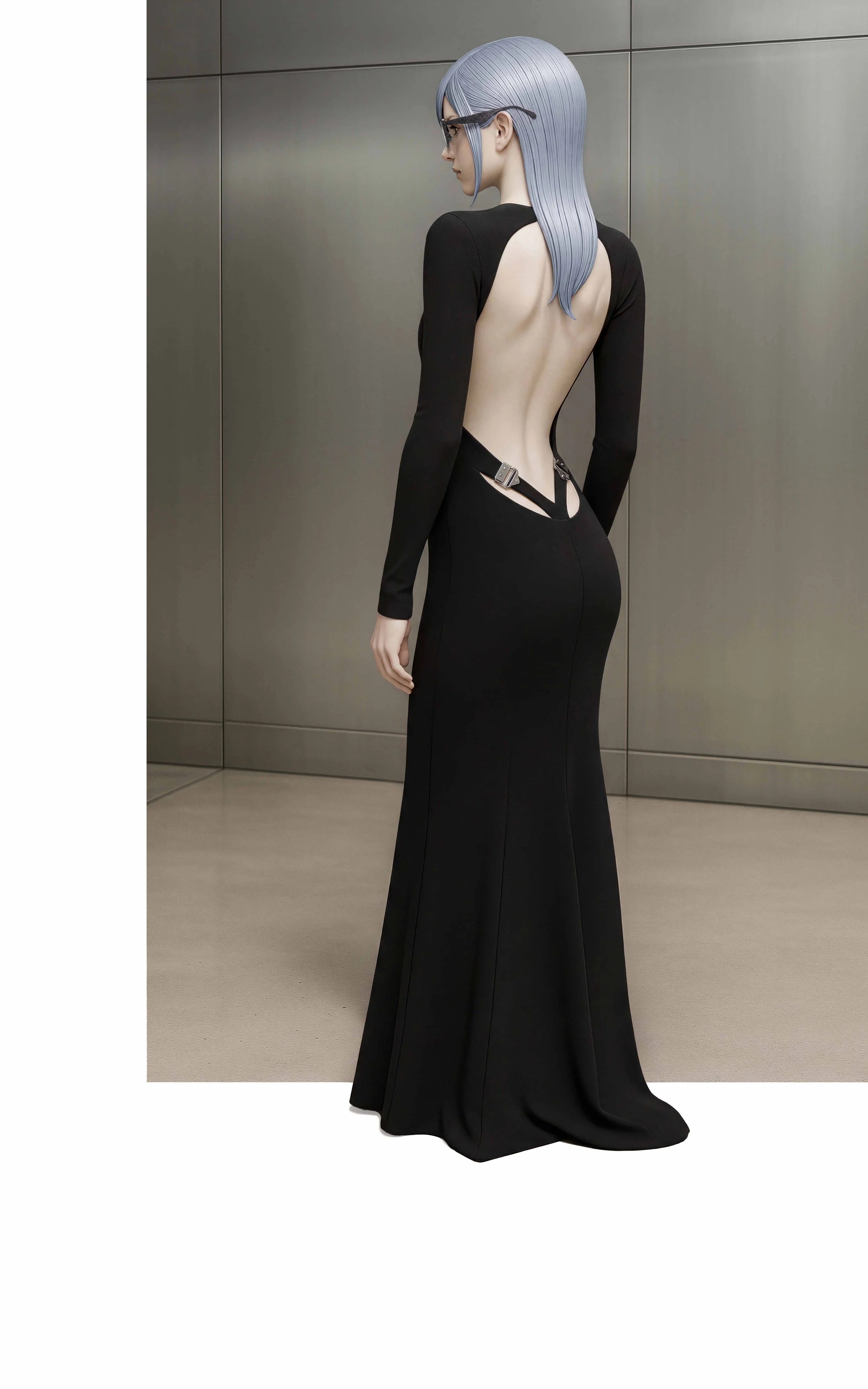
For Accessions I~III, I presented Curator Avatars as otherworldly META-HUMANS. The avatar archetypes CGI figures built from CGI, using a LITTLE AI and A LOT OF Photoshop compositing techniques TO CREATE waxy SKINNED, unsettling, not entirely human MODELS. THE IDEA TO MAKE YOU PAUSE. The visual language draws from clean, clinical Japanese AND KOREAN graphic design, 80’s Comme des Garçons, or 2010’s Unix game engine graphics for Final Fantasy. White space sitS alongside grungy STYLING…a NOD TO THE PRODUCT DESIGN CONCEPT STYLING: ironic or destroyed elements SET alongside THE pristine environment THE LENS.
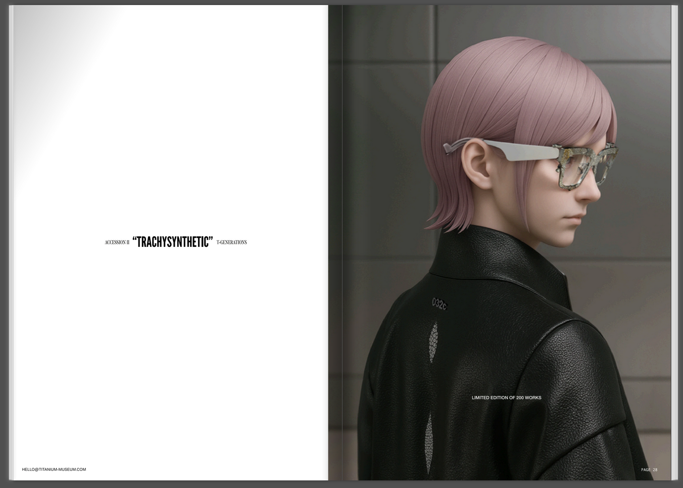
PAGESPREAD FROM ‘ACCESSIONS i~iii’ TITANIUM MUSEUM PHYSICAL CATALOGUE. PART OF THE ‘CAMPAIGN TRAIL’.
END NOTE:
Titanium Museum is an independent eyewear company REGISTERED IN JAPAN AND CONCEIVED IN SCOTLAND by Creative Director E. Gucewicz, producing frames carved from solid titanium and treated with experimental surface processes. The collections are available through selected stockists; for more information, visit TITANIUM-MUSEUM.COm.
FOR THOSE WHO ARE INTRUIGED AS TO KNOW WHERE THE ACCESS POINTS OF THIS PUZZLE ARE - YOU WILL NEED A PHYSICAL COPY OF THE ACCESSION I~III CATALOGUE. APPROPRIATELY FOR A BRAND WHO FOCUSES ON TACTILITY IN OUR DESIGNS, PHYSCIAL INTERACTION WITH THE PRINTED CATALOGUE BOOK IS NECESSARY.
THANK YOU AND SENDING LOVE BACK TO THE SUPERFANS. YOU KNOW WHO YOU ARE.

©E.GUCEWICZ. 2026